1
육각형 div 안에 '레이더'효과가 나타납니다. 그것은 회전하는 이미지이고 육각형 내부에있는 것처럼 보이는 클립 경로가 있습니다. https://jsfiddle.net/f6633a79/17/Chrome에서 CSS 클립 경로가 작동하지 않습니다.
body{

     background : gray;

    }

    $azul : #3399dd;

    $sombra : 0px 0px 35px 2px $azul;


    .center{

     position: absolute;

     margin: auto;

     top: 0;

     right: 0;

     bottom: 0;

     left: 0;

     width: 100px;

     height: 100px;

     z-index: -99;

    }

    .retentor{

     height: 100%;

     width: 87px;

     left: -50%;

     z-index: 1;

     position: relative;

     //clip-path: url(#svgPath);

     clip-path: polygon(0 50%, 25% 0, 75% 0, 100% 50%, 75% 100%, 25% 100%);

     }

     .hexagon .pointer {

     position: absolute;

     z-index: 1024;

     left: -10px;

     right: -10px;

     top: -10px;

     bottom: 50%;

     will-change: transform;

     transform-origin: 50% 100%;

     border-radius: 50% 50% 0 0/100% 100% 0 0;

     background-image: linear-gradient(135deg,

      rgba(255, 255, 255, 0.8) 0%,

      rgba(255, 255, 255, 0.02) 70%,

      rgba(255, 255, 255, 0) 100%

     );

      -webkit-clip-path: polygon(100% 0,

      100% 10%,

      50% 100%, 0 100%, 0 0);

     clip-path: polygon(100% 0,

      100% 10%,

      50% 100%, 0 100%, 0 0);


     animation: rotate360 3s infinite linear;

     }


     @keyframes rotate360 {

     0% {

      transform: rotate(0deg);

     }

     to {

      transform: rotate(-360deg);

     }

     }

     #hex1 {

     width: 75px;

     height: 75px;

     }


     #radar {

     background-color: #39D;

     }

     .centralizador{

     position: absolute;

     left: 50%; \t

     }

     .hexagon-wrapper {

     text-align: center;

     position: relative;

     display: inline-block;

     }

     .hexagon {

     height: 100%;

     width: 57.735%;

     display: inline-block;


     }

     .hexagon:before {

     position: absolute;

     top: 0;

     right: 21.1325%;

     background-color: inherit;

     height: inherit;

     width: inherit;

     content: '';

     transform: rotate(60deg);

     }


     .hexagon:after {

     position: absolute;

     top: 0;

     right: 21.1325%;

     background-color: inherit;

     height: inherit;

     width: inherit;

     content: '';

     transform: rotate(-60deg);

     }

     .hexagonshadow {

     height: 100%;

     width: 57.735%;

     display: inline-block;

     position: absolute;

     left: 20%;

     z-index: -6;

     box-shadow: $sombra;

     animation: shadow 3s infinite ease;

     }


     @keyframes shadow {

     0% {

      opacity: 0;

     }

     50% {

      opacity: 1;

     }

     to {

      opacity: 0;

     }

     }


     .hexagonshadow:before {

     position: absolute;

     top: 0;

     right: 21.1325%;

     background-color: inherit;

     height: inherit;

     width: inherit;

     content: '';

     transform: rotate(60deg);

     box-shadow: $sombra;

     }


     .hexagonshadow:after {

     position: absolute;

     top: 0;

     right: 21.1325%;

     background-color: inherit;

     height: inherit;

     width: inherit;

     content: '';

     transform: rotate(-60deg);

     box-shadow: $sombra;

     }
<div class="center">
<div id="hex1" class="hexagon-wrapper">
<div id="radar" class="hexagon">
<div class="retentor">
<div class="pointer"></div>
</div>
</div>
<div class="hexagonshadow"></div>
</div>
</div>
<svg width="0" height="0">
<defs>
<clipPath id="svgPath" clipPathUnits="objectBoundingBox">
<polygon points="0 0.5, 0.25 0, 0.75 0, 1 0.5, 0.75 1, 0.25 1" />
</clipPath>
</defs>
</svg>문제는 클립 경로 (및 -webkit-클립 경로)가 작동하지 않는 : 여기
내 프로젝트에 동일한 코드의 바이올린입니다 구글 크롬과 안드로이드 용 파이어 폭스에서도 이오니아 페이지를 볼 수 있지만 이오니아 서비스를 통해 PC에서 완벽하게 작동합니다.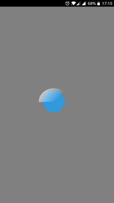
아이디어?
--EDIT--
은 크롬 클립 경로를하기 위해, 모양과 인라인 svgs에 partial support을 것 같다. 그러나 shape 속성을 사용하더라도 제대로 작동하지 않습니다. (하지만 파이어 폭스가 폴리곤과 함께 올바르게 보이고있다) 인라인 SVG가 무엇인지를 찾고있다.--edit 2--
클립 경로가 크롬 (62)에 노력하는 것은 버그 것 같다.