6
뷰포트 및 모든 스크롤에 대해 왼쪽의 다음 단락이 다른 부분으로 강조 표시되고 오른쪽 슬라이드의 전화 화면이 다음 슬라이드로 강조 표시되면 Section 2을 수정하려고합니다. .쇼케이스 기능으로 스크롤 할 때 섹션 피닝
그래서 모든 스크롤에서 다음 텍스트를 강조 표시하고 많은 앱 방문 페이지에서 보는 것처럼 휴대 전화 내부의 sceen을 변경하고 싶습니다. -
뷰포트 및 모든 스크롤에 대해 왼쪽의 다음 단락이 다른 부분으로 강조 표시되고 오른쪽 슬라이드의 전화 화면이 다음 슬라이드로 강조 표시되면 Section 2을 수정하려고합니다. .쇼케이스 기능으로 스크롤 할 때 섹션 피닝
그래서 모든 스크롤에서 다음 텍스트를 강조 표시하고 많은 앱 방문 페이지에서 보는 것처럼 휴대 전화 내부의 sceen을 변경하고 싶습니다. -
에 체크 아웃은 여기에 내가 여기에 무엇을 요약 한 것입니다 :
내가 절대적으로 래퍼에 대하여 제 2 장 (pin)를 배치하고있어 그 나는 그것에 덧붙였다.
청취자의 경우 높이가 일치하도록 핀 높이를 phone 컨테이너와 동일하게 설정합니다.
청취자 섹션 2가 재생/보이지 않게 슬라이드되는지 계산합니다.
var found = false, last = false;;

var lockedScrollTop = 0, step = 0, slide = 1;


var wrapper = $('#wrap');

var pin = $('#pin');

var box = $('#phone');


$(document).resize(function() {

    pin.outerHeight(box.innerHeight());

});


$(document).scroll(function() {

    var offsetTop = -wrapper.offset().top + $(window).scrollTop();


    // conditions on scroll from top down

    if(offsetTop >= 0 && offsetTop < wrapper.outerHeight() && !last) {

    slide = 2;

    } else if(offsetTop >= 0 && offsetTop >= wrapper.outerHeight()) {

    if(!last) {

     $(window).scrollTop(lockedScrollTop);

     last = true;

     slide = 3;

    } else {

     slide = 4;

    }

    }


    // conditions of scroll from bottom up

    if(offsetTop >= 0 && offsetTop < wrapper.outerHeight() && slide === 4) {

    last = true;

    slide = 3;

    } else if(offsetTop < 0 && last) {

    last = false;

    $(window).scrollTop(lockedScrollTop + wrapper.outerHeight() - 1);

    slide = 2;

    } else if(offsetTop < 0 && !last) {

    slide = 1;

    // reset

    found = false;

    lockedScrollTop = 0;

    step = 0;

    }


    // console.log(slide);


    if (slide == 2) {

    if(offsetTop < 0)

     offsetTop = 0;

    pin.css({'top': offsetTop + 'px'});

    if (!found) {

     // calculate step

     lockedScrollTop = wrapper.offset().top;

     step = wrapper.outerHeight()/4;

     found = true;

    }

    // set/unset active text

    var index = Math.floor(($(window).scrollTop() - lockedScrollTop)/step);

    $('#pin .text-container > p').removeClass('active');

    $('#pin .text-container > p').eq(index).addClass('active');

    } else {

    pin.css({'top': 0});

    }

});
section {
display: block;
width: 100%;
height: 100vh;
border-bottom: 1px solid red;
}
.phone-container {
height: 100vh;
width: 500px;
background: red;
display: flex;
align-items: center;
justify-content: center;
float: right;
}
.phone {
width: 200px;
height: 500px;
background: #000;
color: #fff;
display: flex;
align-items: center;
justify-content: center;
}
section.long-scroll {
height: auto;
}
p {
margin-top: 80px;
}
p:first-child {
margin-top: 0px;
}
.text-container {
float: left;
width: 200px;
}
.spacer {
display: block;
width: 100%;
}
p.active {
color: pink;
}
.clearfix:after {
visibility: hidden;
display: block;
font-size: 0;
content: " ";
clear: both;
height: 0;
}
.clearfix {
display: inline-block;
}
/* start commented backslash hack \*/
* html .clearfix {
height: 1%;
}
.clearfix {
display: block;
}
/* close commented backslash hack */
.stuck {
position: fixed;
top: 0;
}
.fixed {
position: fixed;
top: 0;
}
.sticky-wrapper {
height: auto !important;
}
.text-container {
padding-left: 40px;
padding-top: 40px;
}
/*NEW STYLES ADDED*/
#pin {
position: absolute;
right: 0;
top: 0;
}
#pin.transition {
transition: top ease 1s;
}
#wrap {
position: relative;
border: none;
}<script src="https://ajax.googleapis.com/ajax/libs/jquery/2.1.1/jquery.min.js"></script>
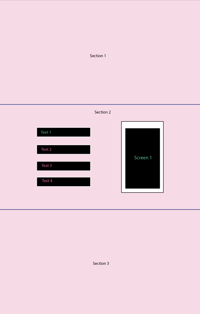
<section>
Scroll-down
</section>
<section id="wrap">
<section class="long-scroll clearfix" id="pin">
<div class="text-container">
<p class="active">Text - 1</p>
<p>Text - 2</p>
<p>Text - 3</p>
<p>Text - 4</p>
</div>
<div class="phone-container" id="phone">
<div class="phone">Slide-1</div>
</div>
</section>
</section>
<section id="unhook"></section>위쪽으로 올라 오는 동안 문제가 있습니다. – undefinedtoken
에 '전환'이 있습니까? – kukkuz
그래, 일반적으로 아무 전이도없이 위아래로 이동하는 동안 스크롤해야합니다. 핀이있는 동안 저크도 있습니다. – undefinedtoken
편집 : 코드를 업데이트하고 여기에 새로운 JSFiddle입니다했다
.
는 는는 올드 답변 :
을 (fullpage.js 유사), 당신은 100vh 각 부분의 높이를 설정하면 시차 태그 게시물 태그 나는 다음과 같은 가정
var lastScrollPos = 0;

var scrollFired = false;


var textConainersElement = jQuery('.text-container p');

var mainElem = jQuery("[data-main='true']");

var firstElem = jQuery("section:first-child");

var lastElem = jQuery("section:last-child");

var wrapper = jQuery(".wrapper");


jQuery(document).on('DOMMouseScroll mousewheel', function(e) {


    // if the scroll has occrued already then dont fire it again until transition ended

    if (scrollFired == true) {

    jQuery(window).scrollTop(lastScrollPos);

    return false;

    }


    var inviewElem = jQuery("[data-inview='true']");

    var nextElem = inviewElem.next();

    var prevElem = inviewElem.prev();

    var currentTop = parseInt(firstElem.attr('data-top'));


    if (e.originalEvent.detail > 0 || e.originalEvent.wheelDelta < 0) {

    // Scrolling down

    // if viewed element is last element do nothing

    if (inviewElem.index() >= lastElem.index())

     return false;


    // if main section is inview then scroll through its elements

    if (inviewElem.index() == mainElem.index()) {

     // if the active child is not the last element then process

     var active = jQuery('.text-container .active');

     if (active.index() != textConainersElement.length - 1) {

     jQuery('.text-container .active').removeClass('active').next().addClass('active');


     // Dont scroll further

     return false;

     }

    }


    var top = currentTop + 100;

    firstElem.css("margin-top", "-" + top + "vh").attr("data-top", top);

    nextElem.attr("data-inview", 'true');

    inviewElem.attr("data-inview", 'false');


    } else {

    // Scrolling up

    // if viewed element is first element do nothing

    if (inviewElem.index() <= firstElem.index())

     return false;


    // if main section is inview then scroll through its elements

    if (inviewElem.index() == mainElem.index()) {

     // if the active child is not the last element then process

     var active = jQuery('.text-container .active');

     if (active.index() != 0) {

     jQuery('.text-container .active').removeClass('active').prev().addClass('active');


     // Dont scroll further

     return false;

     }

    }


    var top = currentTop - 100;

    firstElem.css("margin-top", "-" + top + "vh").attr("data-top", top);

    prevElem.attr("data-inview", 'true');

    inviewElem.attr("data-inview", 'false');

    }


    // Set values to use for next scrolling event

    lastScrollPos = jQuery(window).scrollTop();

    scrollFired = true;


    // reset scrollFired var after transition ended

    firstElem.one('transitionend', function() {

    scrollFired = false;

    });


    //prevent page fom scrolling

    return false;

});
body {
margin: 0;
}
.wrapper {
display: block;
width: 100%;
height: 100vh;
overflow: hidden;
}
section {
display: block;
width: 100%;
height: 100vh;
border-bottom: 2px dashed black;
position: relative;
transition: all 0.5s;
background-color: #c4c4c4;
}
section[data-inview="true"] {
background-color: #929292;
}
.phone-container {
align-items: center;
background: #dedede none repeat scroll 0 0;
border-left: 5px solid black;
display: flex;
float: right;
height: 100vh;
justify-content: center;
width: 500px;
}
.phone {
width: 200px;
height: 500px;
background: #A6A6A6 none repeat scroll 0 0;
color: #fff;
display: flex;
align-items: center;
justify-content: center;
border-radius: 5px;
}
section.long-scroll {
height: auto;
}
p {
margin-top: 80px;
}
p:first-child {
margin-top: 0px;
}
.text-container {
float: left;
width: 200px;
}
.spacer {
display: block;
width: 100%;
}
p.active {
color: #C1E7FF;
}
.clearfix:after {
visibility: hidden;
display: block;
font-size: 0;
content: " ";
clear: both;
height: 0;
}
.clearfix {
display: inline-block;
}
/* start commented backslash hack \*/
* html .clearfix {
height: 1%;
}
.clearfix {
display: block;
}
/* close commented backslash hack */
.stuck {
position: fixed;
top: 0;
}
.fixed {
position: fixed;
top: 0;
}
.sticky-wrapper {
height: auto !important;
}
.text-container {
padding-left: 40px;
padding-top: 40px;
}<script src="https://ajax.googleapis.com/ajax/libs/jquery/2.1.1/jquery.min.js"></script>
<div class='wrapper'>
<section data-inview='true' data-top='0'>
Scroll-down
</section>
<section class="long-scroll clearfix" id="pin" data-main='true'>
<div class="text-container">
<p class="active">Text - 1</p>
<p>Text - 2</p>
<p>Text - 3</p>
<p>Text - 4</p>
</div>
<div class="phone-container">
<div class="phone">Slide-1</div>
</div>
</section>
<section id="unhook"></section>
</div>:
은 그래서 다음 코드를 변경할 것을 기반으로 코드 : https://jsfiddle.net/8zgsdzy0/.
fullpage.js처럼되고 싶지 않아요 – undefinedtoken
새 답변을 내 JSFiddle로 업데이트했습니다. 나는 그것이 당신이 요구하고있는 것이어야한다고 생각합니다. –
이와 비슷한?http://codepen.io/jkochis/pen/ZBxgKd
JS
$(document).ready(function() {
    $(document).on("scroll", onScroll);

    //smoothscroll
    $('a[href^="#"]').on('click', function (e) {
     e.preventDefault();
     $(document).off("scroll");

     $('a').each(function() {
      $(this).removeClass('active');
     })
     $(this).addClass('active');

     var target = this.hash,
      menu = target;
     $target = $(target);
     $('html, body').stop().animate({
      'scrollTop': $target.offset().top+2
     }, 500, 'swing', function() {
      window.location.hash = target;
      $(document).on("scroll", onScroll);
     });
    });
});

function onScroll(event){
    var scrollPos = $(document).scrollTop();
    $('#menu-center a').each(function() {
     var currLink = $(this);
     var refElement = $(currLink.attr("href"));
     if (refElement.position().top <= scrollPos && refElement.position().top + refElement.height() > scrollPos) {
      $('#menu-center ul li a').removeClass("active");
      currLink.addClass("active");
     }
     else{
      currLink.removeClass("active");
     }
     console.log($('#menu-center ul li a.active').attr("href"), $('#menu-center a:eq(0)').attr("href"));
     if($('#menu-center ul li a.active').attr("href") !== $('#menu-center a:eq(0)').attr("href")) {
     $('body').addClass('fixed-product');
     } else {
     $('body').removeClass('fixed-product');
     }
    });
}
HTML
<div class="m1 menu">
    <div id="menu-center">
     <ul>
      <li><a class="active" href="#section1">Section 1</a>

      </li>
      <li><a href="#section2">Section 2</a>

      </li>
      <li><a href="#section3">Section 3</a>

      </li>
      <li><a href="#section4">Section 4</a>

      </li>
     </ul>
    </div>
</div>
<div id="section1"></div>
<div id="section2">
    <div class="product">PRODUCT</div>
</div>
<div id="section3"></div>
<div id="section4"></div>
CSS
body, html {
    margin: 0;
    padding: 0;
    height: 100%;
    width: 100%;
}
.menu {
    width: 200px;
    height: 400px;
    background-color: rgba(0, 0, 0, 1);
    position: fixed;
    background-color:rgba(4, 180, 49, 0.6);
    -webkit-transition: all 0.3s ease;
    -moz-transition: all 0.3s ease;
    -o-transition: all 0.3s ease;
    transition: all 0.3s ease;
}
.light-menu {
    width: 100%;
    height: 75px;
    background-color: rgba(255, 255, 255, 1);
    position: fixed;
    background-color:rgba(4, 180, 49, 0.6);
    -webkit-transition: all 0.3s ease;
    -moz-transition: all 0.3s ease;
    -o-transition: all 0.3s ease;
    transition: all 0.3s ease;
}
#menu-center {
    width: 980px;
    height: 75px;
    margin: 0 auto;
}
#menu-center ul {
    margin: 15px 0 0 0;
}
#menu-center ul li {
    list-style: none;
    margin: 0 30px 0 0;
    display: block;
}
.active {
    font-family:'Droid Sans', serif;
    font-size: 14px;
    color: #fff;
    text-decoration: none;
    line-height: 50px;
}
a {
    font-family:'Droid Sans', serif;
    font-size: 14px;
    color: black;
    text-decoration: none;
    line-height: 50px;
}
#section1 {
    background-color: grey;
    height: 100%;
    width: 100%;
    overflow: hidden;
}
#section2 {
    height: 100%;
    width: 100%;
}
#section3 {
    background-color: blue;
    height: 100%;
    width: 100%;
}
#section4 {
    background-color: red;
    height: 100%;
    width: 100%;
}
.product {
    background: yellow;
    float: right;
    padding: 100px
}
.fixed-product .product {
    position: fixed;
    top: 0;
    right: 0;
}
면책 조항 :이 발견 JSFiddle : https://jsfiddle.net/cse_tushar/Dxtyu/141/ 그리고 내 Codepen 그것을 기반으로.
아니요, 1 차 답을보십시오. 그것은 다소 비슷합니다. – undefinedtoken
흠 ... 나는 광산이 fullpage.js가 아니라는 점을 제외하고 나는별로 다른 점이 없다고 생각한다. 우리가 참조 할 수있는 야생의 어딘가에 예제가 있습니까? –
예, 제공하신 Codepen에서 변경 하시겠습니까? 나는 무엇을 요구하고 있는가? "스크린"안에 그 텍스트를 보여 주겠습니까? –
@LucaDeNardi 두 번째 섹션의 오프셋 상단이 0 일 때 섹션이 고정되고 모든 스크롤시 강조 표시된 텍스트가 다음 페이지로 전환되고 전화기 내부의 화면이 변경됩니다. 그래서 4 슬라이드 후에 섹션이 unhooks 정상적으로 스크롤을 시작합니다 – undefinedtoken
당신이 설명하는 무엇 입니까이 플러그인으로 수행 할 수있는 무언가처럼 들리 네요 : http://scrollmagic.io/ – mhatch